Download Corporate Calendar 2026 Download
You have delivered the presentation. The slides looked good, you hit your talking points, and the audience nodded along. But was it effective? Did people understand your message? Did they stay engaged? Would they act on it tomorrow?
For years, answering those questions meant guesswork — a feedback form with three vague responses, or a colleague saying “nice job” without specifics. AI changes that. Today, tools powered by machine learning can analyse your delivery, your slides, and even your audience’s reactions — giving you data, not opinions.
This article covers practical ways to use AI to measure and improve your presentation effectiveness, from speech analysis to slide design scoring to real-time audience sentiment tracking. Whether you present in a boardroom, a classroom, or over Zoom, these techniques work in Singapore’s corporate environment and beyond.
Why Traditional Feedback Falls ShortBefore diving into AI, it is worth understanding what is broken about the old way:
AI solves these problems by capturing objective data in real time: what you actually said, how you said it, what your slides looked like, and how the room responded — second by second.
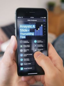
The single biggest factor in presentation effectiveness is delivery. AI speech analysis tools break your delivery into measurable components.
Tools like Otter.ai, Fireflies.ai, and Microsoft Speaker Coach (built into PowerPoint and Teams) transcribe your presentation and flag:
PowerPoint’s Speaker Coach runs while you rehearse. It gives on-screen nudges: “You are reading from the slide” or “Try varying your pitch.” This is like having a presentation coach in the room during practice, not after.
After three practice runs with AI speech analysis, you will see patterns. Most people discover they say “um” 40+ times in a 20-minute talk without realising it. Cut that to 10, and the audience perceives you as more confident — even if nothing else changes.
Slides are the visual half of your presentation. Bad slides sabotage good speakers. AI can now evaluate slide design against data-backed principles.
| Element | What AI Measures |
|---|---|
| Text density | Words per slide. Above 30 words, retention drops sharply. |
| Font hierarchy | Are headings clearly distinct from body text? Does your eye know where to go? |
| Colour contrast | Is text readable against backgrounds? WCAG accessibility standards applied. |
| Image relevance | Does the image support the message or is it decoration? AI vision models score this. |
| Reading order | Screen-reader compatibility. Important for accessibility compliance in Singapore government and MNC settings. |
| Data visualisation clarity | Are charts labelled? Is the right chart type used for the data? |
A 2019 study by the Presentation Guild found that audiences rate presenters as 26% more credible when slides follow basic design principles. AI makes those principles automatic.
This is where AI gets genuinely impressive. Instead of asking “any questions?” and getting silence, you can measure engagement in real time.
Tools like Zoom’s AI Companion (included in paid plans) and Microsoft Teams Premium can analyse:
Privacy note: In Singapore, PDPA rules apply. Always inform participants if AI analysis is active. Enterprise tools aggregate data — they report “the room was 70% engaged at minute 12,” not “John was bored.”
Tools like Mentimeter, Slido, and AhaSlides integrate AI to:
After a Zoom or Teams meeting, AI generates a report showing:
This turns “I think it went well” into “slide 7 caused a 40% attention drop — let me rework it.”
The words on your slides and in your script matter as much as your delivery. AI writing tools can evaluate your content structure.
Before (AI-scored poorly):
“The synergistic integration of our cross-functional operational frameworks will facilitate enhanced stakeholder value propositions through optimised resource allocation methodologies.”
After (AI-suggested rewrite):
“By getting our teams to work together better, we can deliver more value to clients with the same resources.”
Same message. Second version scores higher on readability, clarity, and engagement. AI does not change what you say — it changes whether people understand it.
AI Video Analysis of Recorded PresentationsFor asynchronous presentations — training videos, webinar recordings, sales demos — AI video analysis takes everything further.
If 60% of viewers drop off at minute 4, your introduction is too long. If a specific slide gets rewatched 3×, that content is confusing or important. AI-generated heatmaps of viewer attention tell you exactly where to tighten.
Using AI once is interesting. Using it systematically makes you better every time. Here is a repeatable workflow:
| Step | Action | Tool Example |
|---|---|---|
| 1. Script | Run speaker notes through readability and jargon check | Grammarly, Hemingway |
| 2. Slides | AI design analysis for text density, contrast, layout | PowerPoint Designer, Canva AI |
| 3. Rehearse | Record practice run with speech analysis | Speaker Coach, Otter.ai |
| 4. Deliver live | Capture audience engagement and sentiment | Mentimeter, Zoom AI Companion |
| 5. Review | Analyse recording for pacing, filler words, engagement timeline | Yoodli, Fireflies.ai |
| 6. Improve | Apply top 3 findings to next presentation | — |
Month 1: You discover you say “um” 52 times per 20-minute talk. Speech analysis confirms it. You practise reducing it.
Month 3: Filler words drop to 18 per talk. AI also flags that your slides average 47 words each. You redesign them to 20 words average.
Month 6: Your audience engagement scores rise from 55% to 78%. AI sentiment analysis shows fewer confused expressions during complex sections. Meeting feedback forms show 4.8/5 ratings instead of 4.1.
This is not theoretical — it is measurable, incremental improvement driven by data.
| Tool | Best For | Cost | Singapore Availability |
|---|---|---|---|
| PowerPoint Speaker Coach | Rehearsal feedback, pacing, filler words | Free with Microsoft 365 | Yes |
| Otter.ai | Transcription, post-meeting analysis | Free tier / Pro ~$16/mo | Yes |
| Fireflies.ai | Meeting transcription, sentiment, engagement scores | Free tier / Pro ~$18/mo | Yes |
| Yoodli | Video presentation coaching, eye contact, body language | Free tier / Pro ~$12/mo | Yes |
| Mentimeter | Live polling, word clouds, AI-generated quiz questions | Free tier / Pro ~$18/mo | Yes |
| Grammarly | Script readability, tone, clarity | Free tier / Premium ~$15/mo | Yes |
| Canva AI | Slide design analysis, layout suggestions | Free tier / Pro ~$13/mo | Yes |
| Zoom AI Companion | Attention tracking, meeting summary, talk ratio | Included in paid Zoom plans | Yes |
All tools listed are accessible from Singapore and comply with standard enterprise data policies. Check individual privacy terms if handling sensitive or government data.
AI does not make you a better presenter by magic. It gives you something better than magic: data. Instead of wondering whether your presentation landed, you know — slide by slide, word by word, audience reaction by audience reaction.
Start with the free tools: PowerPoint Speaker Coach for rehearsal, Grammarly for script clarity, and Mentimeter for live audience engagement. Add video analysis with Yoodli when you are ready to go deeper. Build the 6-step feedback loop into your routine, and in six months you will have objective proof of improvement — not just a feeling.
For Singapore professionals looking to master AI-enhanced communication, explore CBS Training’s AI and business productivity courses at www.cbs.com.sg. From AI problem-solving toolkits to presentation design workshops, CBS equips you with the skills to present with confidence backed by data.
Published by CBS Training, Singapore. For course enquiries, visit www.cbs.com.sg or call (+65) 6338 3882.
https://www.cbs.com.sg/how-can-i-use-ai-to-analyse-my-presentation-effectiveness/
copy